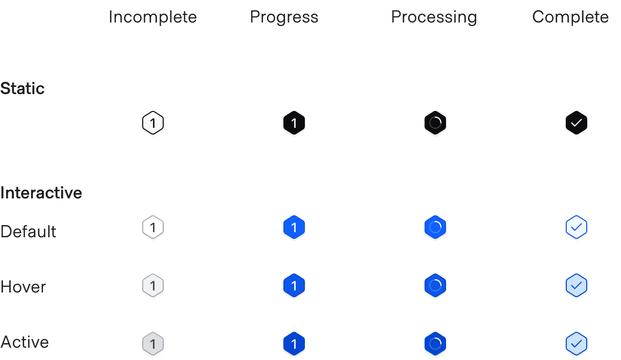
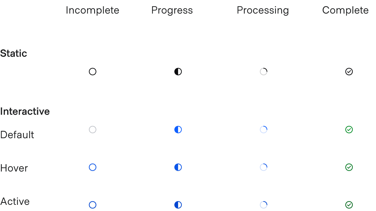
When advancing through a multi-step flow or feature, a Stepper Indicator helps users maintain context and directionality. In certain circumstances, it could act as a navigational device between steps. It’s generally assembled as part of a larger Stepper pattern.
Usage
When to use
- As a visual decorator to assist in the status and context of a multi-step flow.
- Within a larger stepper or step item pattern paired with a label and description.
When not to use
- In isolation, consider a standard icon.
Content
While the most common example of content within a Step Indicator is numerical (1, 2, 3), other types of sequential ordering may also be used (A, B, C).
The Stepper Indicator indicates the relational step value, helping users maintain context in a multi-step flow or sequence. It should be used in larger stepper item patterns with an appropriate label, description, and design language indicating directionality.
There are two types of indicators: Step::Indicator and Task::Indicator, which can be used in conjunction, or separately depending on hierarchical needs or requirements.
How to use the Stepper::Step::Indicator
Although not required, the basic invocation should include text and status arguments.
<Hds::Stepper::Step::Indicator @text="1" @status="incomplete" />
Adding interactivity
The indicator components are generally meant to be assembled into larger stepper item patterns, so the component’s interactive states should be tied to the larger pattern. This includes hover, active, and focus. That said, to add interactivity directly to the Step Indicator, set the @isInteractive argument to true.
<Hds::Stepper::Step::Indicator @text="1" @status="incomplete" @isInteractive= />
Indicating status
To change the status of the Step Indicator, set the @status argument to incomplete, progress, processing, or complete.
<Hds::Stepper::Step::Indicator @text="1" @status="progress" @isInteractive= />
<Hds::Stepper::Step::Indicator @text="1" @status="processing" @isInteractive= />
<Hds::Stepper::Step::Indicator @text="1" @status="complete" @isInteractive= />
How to use the Stepper::Task::Indicator
Although not required, the basic invocation should include a status argument.
<Hds::Stepper::Task::Indicator @status="incomplete" />
Adding interactivity
The indicator components are generally meant to be assembled into larger stepper item patterns, so the component’s interactive states should be tied to the larger pattern. This includes hover, active, and focus. That said, to add interactivity directly to the Task Indicator, set the @isInteractive argument to true.
<Hds::Stepper::Task::Indicator @status="incomplete" @isInteractive= />
Indicating status
To change the status of the Task Indicator, set the @status argument to incomplete, progress, processing, or complete.
<Hds::Stepper::Task::Indicator @status="progress" @isInteractive= />
<Hds::Stepper::Task::Indicator @status="processing" @isInteractive= />
<Hds::Stepper::Task::Indicator @status="complete" @isInteractive= />
Component API
We provide two separate but related Stepper Indicator components that serve different hierarchical purposes:
Stepper::Step::Indicator: used for step-based flows containing multiple steps a user must complete sequentially.Stepper::Task::Indicator: used either on its own to denote smaller task-oriented flows or combined with the Step Indicator to list multiple tasks within a step.
Stepper::Step::Indicator
status
enum
- incomplete (default)
- progress
- processing
- complete
Step::Indicator.
isInteractive
boolean
- false (default)
Step::Indicator.
text
string
Stepper::Task::Indicator
status
enum
- incomplete (default)
- progress
- processing
- complete
Task::Indicator.
isInteractive
boolean
- false (default)
Task::Indicator.
Anatomy
Step indicator

| Element | Usage |
|---|---|
| Text | Required (indicates the step sequence) |
| Container | Required |
Task indicator

| Element | Usage |
|---|---|
| Icon indicator | Required |
States
Step indicator

Task indicator

Conformance rating
The Stepper Indicator components are not WCAG-conformant on their own.
Best practices
For practical accessibility purposes, consider a Stepper (the whole component) a list of items, with each step being a list item.
Applicable WCAG Success Criteria
There is no specific WCAG Success Criteria applicable to the Stepper Indicator on its own. Since we’re only providing the Stepper Indicator and not the entire stepper, product teams are responsible for ensuring WCAG conformance is met in any components they build.
Support
If any accessibility issues have been found within this component, let us know by submitting an issue.